The Digital Divide: Unpacking the Screenification of Car Interiors and the Resurgence of Tactile Control
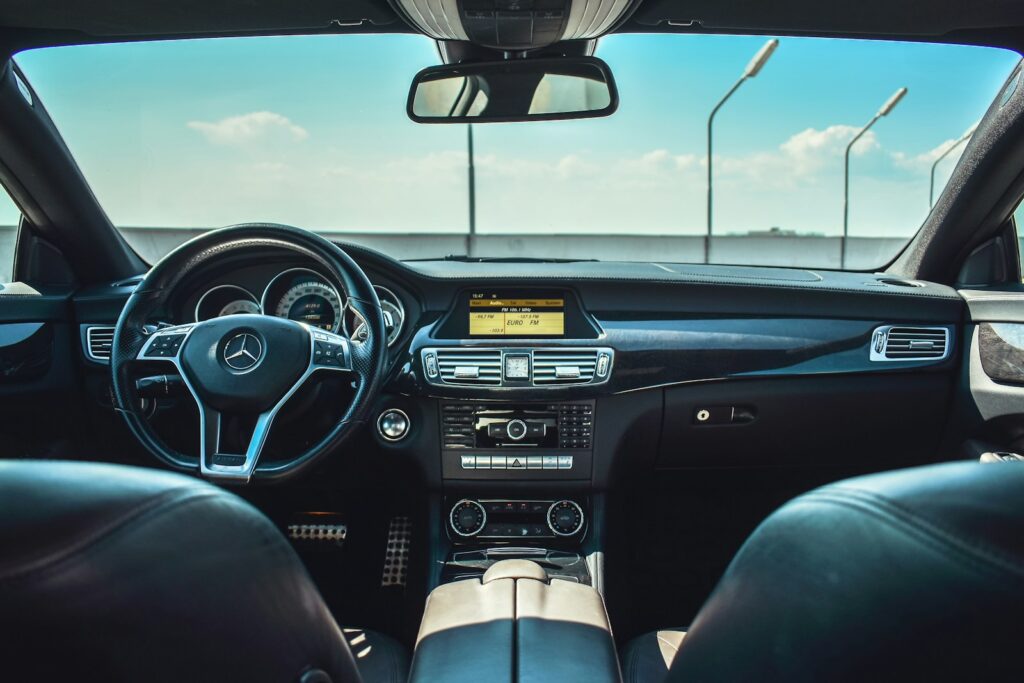
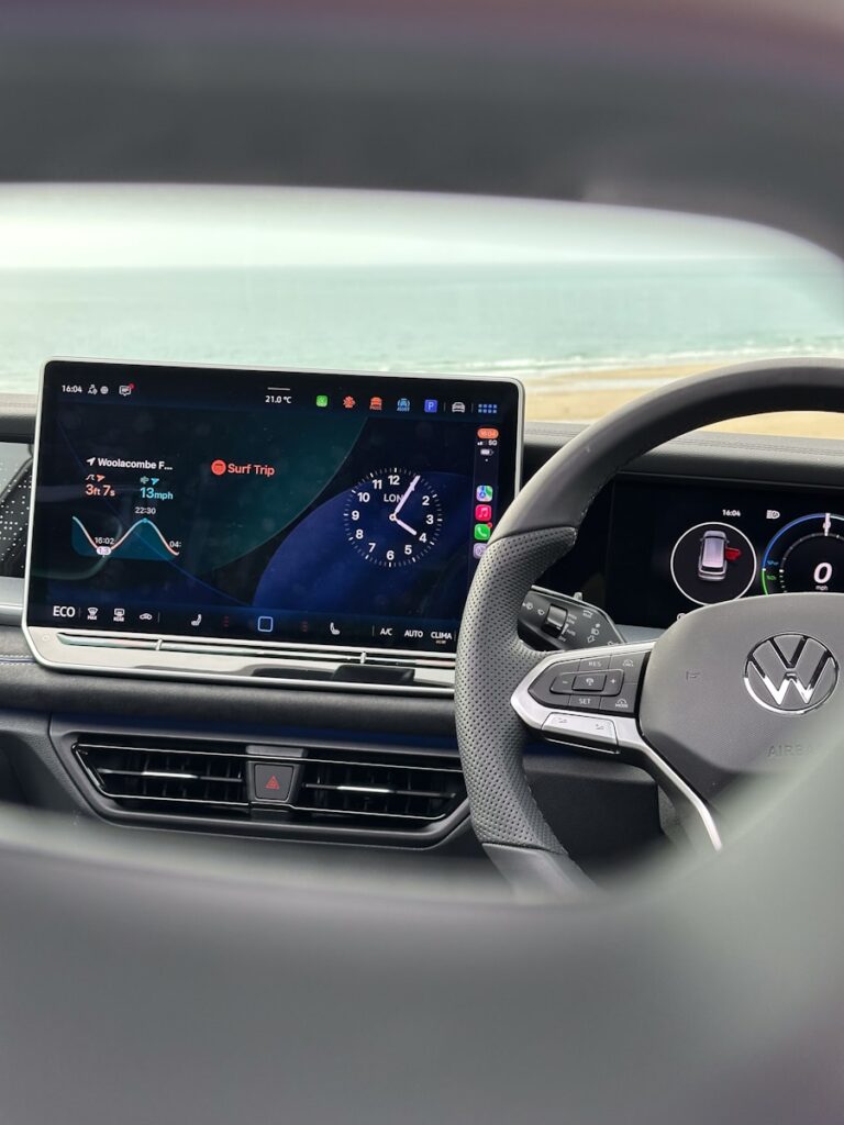
The car world’s changing fast because of new tech, flipping how we see vehicles and use them every day. For a while, things looked obvious: old-school knobs and switches – the stuff you could feel – were slowly being swapped out for smooth screens that do ten jobs at once. That move was supposed to bring drivers something cleaner, smarter, easier to tweak, matching the screen-filled way most of us live now.
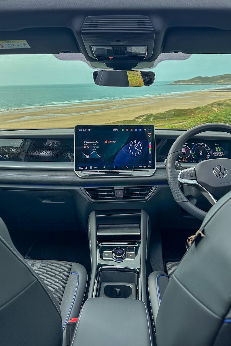
Still, all these screens piling up – right on the dash or even the steering wheel – haven’t gone smoothly. At first, it was about looking sleek and doing more stuff at once. But now, real problems show up fast when you’re actually driving. A car moves, things change quick, sometimes dangerously so. Cool tech looks good until it messes with your focus. Touchscreens and menus get in the way instead of helping out.
This piece looks at how car buttons changed over time, showing why companies started using more screens instead of knobs or switches. Because touchscreen fever spread fast across automakers, pushing features once thought impossible into dashboards. Yet now, people behind the wheel are getting frustrated – eyes off road too long, fingers fumbling through menus. Safety folks have been warning about distractions piling up during drives. Meanwhile, old-school mistakes made years ago keep causing problems today. Interacting with flashy displays takes mental effort we don’t always have while moving. Data shows drivers often prefer real buttons they can feel without looking. So even though tech pushed hard toward full digitization, there’s a quiet shift happening now – back to simpler, hands-on controls.
1. The Automotive Industry’s Addiction to Touchscreens: A Design Trend Rooted in Minimalism
Years went by with automakers totally hooked on cabins full of touchscreens – no switches at all. A big reason? They were chasing clean looks, aiming for spaces that felt modern and smooth. That shiny, continuous screen instead of a cluttered panel drew strong interest – not just from engineers but also buyers who liked it slick.
Automotive Minimalist Interface Synopsis:
- Designers gravitated toward sleek, uninterrupted digital surfaces.
- People who liked sleek, high-tech looks helped push this wave forward – yet their influence grew quietly over time.
- Complicated setups turned into a trendy look, pushing dashboards packed with displays.
Steven Kyffin, once head of design at Northumbria University, says designers often push simplicity aside – ending up with cluttered results. In his view, managing complicated designs gives people a sense of control. That drive, along with some buyers who crave cars that look ultra-sleek or wildly futuristic, pushed automakers to add flashy digital screens everywhere – even if they weren’t very useful.
The good ideas made sense on paper: swapping out old-school dials for a screen like a tablet might open up room up front. A single hub taking over the dash echoed a trend people called an obsession with digital dashboards – pushing for cleaner, newer interiors. Still, once companies started caring more about how things looked and how many functions they could jam onto one screen, real-world problems popped up for drivers actually using them while moving.
2. EuroNCAP’s Safety Mandate: Driving the Return of Physical Buttons
The tide’s clearly turning – thanks mainly to safety groups waking up to how risky screen-based controls really are. Take EuroNCAP, Europe’s car crash-test crew – they’re pushing hard on this front. From January onward, they’ll reward carmakers who add real buttons and knobs that you can feel and use without looking. Those changes could make or break a vehicle’s top safety score.
EuroNCAP Control-Safety Directive:
- Safety scores lately favor physical knobs or switches instead.
- Important tasks shouldn’t rely solely on electronic switches.
- Tougher rules set for the 2027 round – changes rolling in slow but sure.
Matthew Avery, who helps shape plans at EuroNCAP, sent a firm message to car makers – time to rethink touchscreens. He said drivers need real buttons again. The group’s latest rules make one thing clear: no more swiping or tapping when driving. When your hands are on the wheel, you shouldn’t wrestle with menus. Things like turn signals, windshield wipers, or flashers must work mechanically. Digital steps slow things down. Physical switches give faster access. Safety comes first, so simplicity wins out.
This new rule isn’t completely blocking five-star ratings without physical buttons, yet EuroNCAP says getting into the top tier will gradually get tougher. Besides that, Avery mentioned they’ll turn up the heat – introducing sharper testing rules by 2029 in their upcoming three-year phase. The goal? Push carmakers worldwide to rethink how vehicles are built. He added it’d be odd if safety approaches suddenly varied across regions.

3. Volkswagen’s Public Confession: Acknowledging Past Digital Mistakes
One of the first big mea culps came from car giant VW. The company now admits touchscreen gadgets didn’t work well at all. Just last month, lead designer Andreas Mindt said future cars will ditch those touch panels – instead, they’re adding real buttons for key tasks.
Volkswagen User-Interface Reform:
- VW says older touchscreens didn’t work well.
- Key hardware buttons are coming back on all models – so you’ll actually have them where it counts.
- A renewed focus on safety-oriented usability replaces design minimalism.
Mindt said knobs are coming back – for volume, seat heat, airflow, and hazards. He told a UK auto mag, Autocar, this’ll happen in every single model going forward. Big shift, right? Back in 2019, VW called their high-tech Golf Mk8 easy to use and cutting-edge – labels that didn’t hold up once drivers got behind the wheel.
Mindt spoke plainly, showing something big is changing. “We won’t repeat this error – ever,” he said. Not a handset, but a ride. That line hits hard – it shows people now get it: what works on a still screen fails on the road. Admiting old flaws out loud, they’re shifting focus – to keep drivers safe and things simple.
4. The “Cognitive Load” and Loss of Tactile Affordances in Digital Cockpits
The big issue with car touchscreens, according to design pros, is they make drivers think way more than needed. As Steven Kyffin at Northumbria University puts it, swapping physical controls for screens removes cues that once made driving feel automatic. Buttons, knobs, and switches gave clear feedback – so you could use them without looking.
Driver Cognitive-Ergonomics Assessment:
- Analog dials let you adjust without looking – just by touch.
- Touchscreens make your brain work harder while you focus on the screen.
- Loss of familiar hand movements messes up smooth driving rhythm.
Kyffin says analog knobs let you find them by touch – tune things while watching the road. That sense of feel keeps focus where it should be, so hands work without needing eyes. Each knob clicks just right – or fits your fingers a certain way – so you know it’s done. No glance needed; your skin tells you.
In stark contrast, a touchscreen “obliterates this,” according to Kyffin. He emphasizes the critical difference: “Now, you must look, think, and aim to adjust the temperature or volume. That’s a huge cognitive load, and completely at odds with how we evolved to interact with driving machines while keeping our attention on the road.” This constant need for visual confirmation, even for routine tasks, significantly elevates the risk of distraction and undermines the intuitive flow of driving.

5. Driver Dissatisfaction: The Overwhelming Preference for Physical Controls
The move toward screens instead of buttons has stirred pushback from folks driving these cars every day. Studies across different regions show most favor old-school knobs and switches. According to a poll by UK-based What Car?, nearly 89 percent out of 1,428 motorists liked real controls better than digital displays.
Consumer Interface-Preference Insights:
- People clearly pick buttons instead of screens, according to surveys.
- U.S. happiness dips because entertainment systems feel too confusing.
- Basic chores usually turn into several online steps.
Last time, a JD Power check on American drivers showed happiness with cars dropped for two years straight – never happened before in nearly three decades. What upset most folks? Fiddly touchscreen gadgets inside the vehicle that don’t work right. According to Kathleen Rizk, who checks tech usability at JD Power, people now say certain features either do nothing helpful or just bug them nonstop
The practical frustrations often extend to surprisingly simple tasks. For example, opening a Tesla’s glove compartment requires navigating through a digital menu: “First thing,” one YouTube tutorial begins, “is you’re going to click on that car icon to access the menu settings, and from there on, you’re going to go to controls, and right here is the option to open your glove box.” This complex procedure for a basic function starkly contrasts with the “satisfying IRL prod on a gloriously yielding and clicking clasp” of a traditional glove compartment, proving Ronald Reagan’s adage: “If you’re explaining, you’re losing.”
6. The scary truth about safety: how slow touchscreen responses compare to drunk driving
Beyond being just distracting, the rise of touchscreens inside cars brings clear dangers. Studies keep showing that using built-in entertainment tech slows driver reactions – sometimes as much as drinking does, maybe more. When you hear Steven Kyffin say drivers must remember they’re handling something dangerous, it hits harder next to those facts.
Touchscreen Distraction-Risk Evaluation:
- Touchscreens slow response times – worse than drinking too much booze.
- Doing things on screens usually takes more time than using physical tools.
- Distracted driving plays a big role in many crashes across Europe.
A 2019 report from UK-based traffic experts TRL – hired by safety group IAM RoadSmart – turned up some scary findings. Using Apple CarPlay manually slowed driver response more than anything else tested. In fact, reactions got about fivefold slower compared to being over the alcohol limit, also much worse than while high on marijuana. This kind of info really pushes the need to rethink how we depend on in-car tech.
On top of that, a 2022 test by the Swedish car publication Vi Bilägare looked at how well physical buttons stack up against touchscreens. Instead of just guessing, they timed drivers doing things like changing heat settings or switching radio stations. Turns out, using knobs and switches in a 2005 Volvo V70 got jobs done in less than 10 seconds – barely needing glances away from the street. But when people tried those same actions on an MG Marvel R, an electric crossover full of deep digital menus, it dragged on for about 45 seconds – all while staring down at screens instead of ahead. Meanwhile, data from the European Commission showed around one in four accidents across Europe ties back to distractions behind the wheel. Because of this split attention, drivers often drift slightly side to side, respond slower to sudden changes, and miss key details happening nearby.
7. The Buick Riviera’s Unheeded Warning: A Historical Precedent of Digital Failure
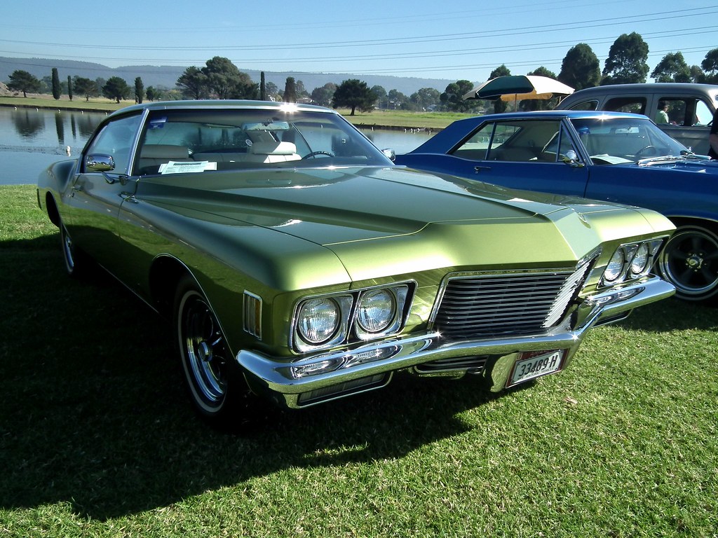
The problems with car touchscreens aren’t fresh – there’s been a warning from the past that’s mostly ignored over years. Back in ’86, the Buick Riviera became the first ride to get a built-in touchscreen. That version was a small 9-inch screen with green letters on black, called the Graphic Control Center. It could handle 91 different jobs – one managed trips, another adjusted cabin temp, checked engine health, or told you when service was due.
Early Digital Dashboard Retrospective:
- The 1986 Rivija’s touch screen rubbed buyers the wrong way.
- Its tricky nature + potential to distract hinted at current problems.
- Sales tanked – so GM ditched the idea fast.
Even though it was new and different, this first digital setup didn’t sell well. GM admitted people really disliked it; because of that, along with making the car smaller, sales dropped hard – down 63% compared to last year. Buyers pushing back showed how risky it can be to use too many digital buttons while driving.
Buick quickly dropped the Riviera’s screen – proof people hated it and found it useless. A TV show testing the car back then raised a sharp warning: “Could glancing at this pull your eyes off the road?” Asked almost 40 years ago, that concern still hits hard now. It shows the big problems we see with today’s touch displays – distracting drivers, clunky use – were already obvious right when digital dashboards began.
Though touchscreens in cars bring problems and annoyances, we need to see what really pushed them forward. Car makers didn’t go digital just for flashy looks – money reasons played a big role. Also, how cars are built today keeps changing, which helped speed things up.
This part dives into the money side of things, while looking at how digital dashboards keep changing – like with voice commands playing a bigger role, or screens popping up on steering wheels outta nowhere – on top of some car brands slowly bringing back actual buttons and knobs. We’re also checking what it all means for future rides as they hook deeper into our daily tech routines, balancing cool new features with keeping drivers safe and interactions simple.
8. The Economic Rationale: Why Touchscreens Became Ubiquitous
The rise of touchscreens in car dashboards ties back to money. Cheaper for makers – software-driven screens usually cost less than tons of mechanical buttons plus all the wires and circuits that go with them. Since cutting costs matters a lot in a crowded auto industry, companies lean toward these digital setups without hesitation.
Automotive Interface-Cost Optimization:
- Touchscreens cut down on production expenses while simplifying electrical setup.
- Using shared tools helps different brands grow together – yet keeps things running smooth without extra costs.
- OTA updates keep digital setups cost-effective over time.
On top of that, these tech tools save big on costs for carmakers running multiple brands, say Volkswagen’s bunch. Instead of building separate systems, they can use identical parts – both hardware and software – for different labels like Skoda or Seat, just swapping out splash screens. That shift cuts down on engineering work and speeds up rollout. Sharing the base setup means teams tweak designs faster, build smarter, and keep expenses low – all without extra hassle.
On top of upfront build expenses, screens have become pretty much essential for today’s software-driven cars – ones that use frequent wireless updates. Because these upgrades let makers tweak things like music setups, mood lights, or styling details even months after selling the car. Rolling out fresh tools or smoothing rough edges works way better when done through display-based programs instead of redoing knobs and circuits inside the dash.
9. The Promise and Pitfalls of Advanced Digital Interfaces: Voice Control
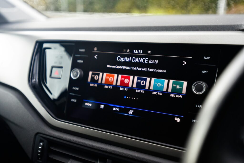
Car makers want to fix complaints about touchscreens being distracting. So they’re testing smarter voice systems instead. Their aim? Use smart software that understands talking like people do. That way, drivers can just speak commands – no tapping or looking around needed. It’s part of a bigger move toward keeping hands on the wheel and eyes on the road.
In-Vehicle Voice-Interaction Outlook:
- Smart helpers try cutting down on fiddling with menus.
- Mercedes integrates LLMs for conversational usability.
- Challenges stick around – like spotting things right or feeling out of place socially.
Take Mercedes-Benz – they’ve built ChatGPT right into their cars’ voice commands, so chatting with your dashboard feels smoother. The idea? These upgrades might actually make voice controls work like they were supposed to years ago. When it clicks, you can tweak the AC, switch songs, or set a route – all without lifting a finger.
Still, it’s way too soon to call these latest versions an outright win. Even though things are getting better, old problems with voice commands stick around – like spotty understanding or feeling weird talking out loud in front of others. The goal? Make driving easier by cutting mental strain and taking eyes off the road. Yet reaching that smooth, no-hassle voice system everyone likes isn’t here yet; plenty of carmakers keep betting on touchscreens anyway.
10. The Emergence of Steering Wheel Screens: A New Frontier of Digital Displays
While carmakers rethink big center screens, fresh ideas keep moving displays into unexpected spots – like the steering wheel. A company called ZF, which builds parts for vehicles, made a compact display that sits right in the middle of the wheel, tucked among regular buttons and knobs. This adds a new spot where drivers can see info, but it also sparks debate over whether it helps or just pulls attention away.
Steering-Mounted Display Innovation:
- ZF’s building smart steering wheels – these include built-in displays while still working with airbags.
- Might swap out – or team up with – HUDs and old-school dials.
- Raises fresh doubts on distraction or usefulness – sparking curiosity instead of answers. Yet hints at deeper issues beneath the surface.
A big hurdle in building this setup? Fitting in the airbag gear. The LIFETEC team at ZF tackled it – by crafting a design where the bag tucks tightly behind the middle display. Team members say the driver’s airbag turns right along with the steering wheel, letting it burst out from the same slot no matter how the wheel’s turned. Works like a regular one, puffing up through the space between the hub and top edge.
The real-world use of steering wheel displays in regular cars isn’t fully figured out yet. Although race events – such as Formula 1 – have used them for ages to show key data because there’s no room inside the cockpit, it’s unclear if normal vehicles really need them. Some think these screens might take over from or work alongside existing driver info systems, maybe even replacing HUDs or classic gauges, leading to simpler dashboards and possibly better view ahead. Still, one big worry is they might pull attention away from driving.
